The component approach
One of the most important things I’ve learnt in my time as a front-end developer is the value of ‘components’. We hear the term being tossed around all to often in the community, but to many of us components are still a foreign concept.
In this article I will aim to clarify:
- What we really mean by ‘components’.
- How we can make our own components.
- What the advantages to this approach are.
What is a component?
“a part that combines with other parts to form something bigger”
- Cambridge Dictionary
When I talk about a component in the context of development, I’m referring to a distinguishable part of user interface that when combined with other parts, forms a final application. A UI component comprises of markup (HTML), styling (CSS) and, when needed, interactions (JS).
Encapsulation
A component is usual self contained. This means that even in isolation the part should fulfill its responsibilities.
Machinery is a great metaphor for this. A car a is full of components, many of these are made and tested in isolation by manufacturers across the world. Each component has a strict specification, so that when they are brought together at the assembly stage they can smoothly interact together, and form final product. Let’s look at one part in particular: the starter motor.
The starter motor
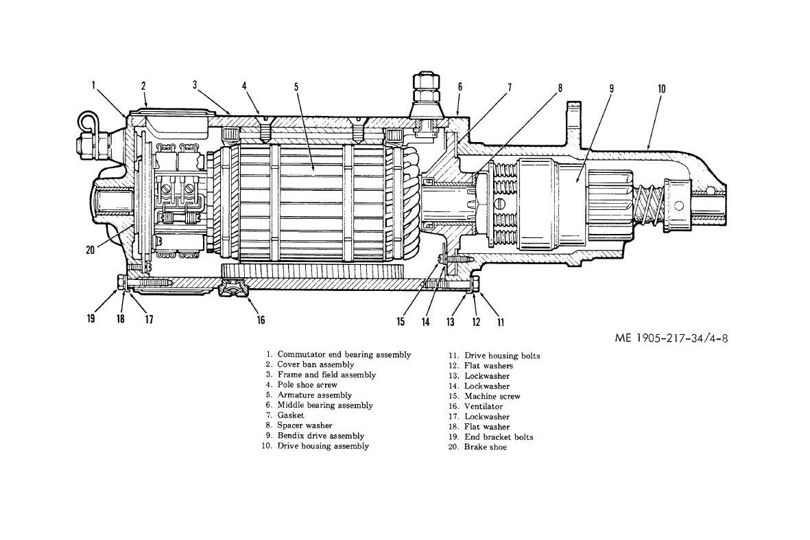
The starter motor has one job: when a 12v current is connected at one end (expected input), the cog at the other end must spin (expected output). The user (the person assembling the car) need not be aware of the how the part does it’s job, but just how to provide the expected input and make use of the expected output.
The <video> element
Let’s jump to an example a little closer to home: the <video> element. This is a prime example of a component. It has an expected input: the src attribute, and and expected output: a playable video element. What goes on under the hood, is not really a concern to us as ‘the user’ of the component.

The <video> element is a little more complicated to work with than the starter motor. Is has a larger interface and has many different states. Fortunately the component gives us a simple public interface to control it,
video.play()video.pause()video.load()video.canPlayType(format)
And can tell us when its state changes via events that we can listen to using the standard .addEventListener() API,
'canplaythrough''ended''error''playing''progress''waiting''loadedmetadata'
These tools give us as ‘users’, full control over the <video> element without having to know any of it’s internal makeup. To us it’s a black box, and this is a very good thing!
Definition
There are infinite ways to define components. You don’t even need a framework or library to being working with components.
var MyComponent = function() {
  this.el = document.createElement('div');
};

MyCompoent.prototype.render = function() {
  this.el.innerHTML = 'hello world';
};

// Create one
var component = new MyComponent();

// Render it
component.render();

// Put it in the DOM
document.body.appendChild(component.el);
Although simplistic, this vanilla approach has scope to get messy, and in large teams, believe me, it will!
At the Financial Times we wrote a library called FruitMachine to do the job of defining and assembling our view components. FruitMachine established team conventions and guaranteed interoperability of components.
The same component created using FruitMachine would look like,
var MyComponent = fruitmachine.define({
  name: 'my-component',
  template: function() {
    return 'hello world';
  }
});

// Create one
var component = new MyComponent();

// Render it
component.render();

// Put it in the DOM
component.appendTo(document.body);
Why build our own?
There are many pre-existing libraries we could have chosen to do the job of managing our layouts, but we had some specific requirements:
- New components need to easily work alongside old legacy code.
- Layouts need to be able to be rendered as strings on the server-side.
- Should have the ability to define layouts as an arbitrary collection of components.
- No large dependencies (eg. jQuery).
Retro-fitability
Large applications tend to live for a long time. Code bases grow, and as a result complete application re-writes become unfeasibly expensive. It is beneficial with these kind of applications to be able to introduce new architectural changes incrementally, so this was a big requirement for our component library.
To achieve this, a view library has to be relatively un-opinionated about the rest of my application, so that it can be used alongside old code.
Library weight was also a concern. It is unlikely that the rest of your team will be happy with you experimenting with a new approach if it is costly to do so. Start small. Plant experimental seeds of change; if an experiment is a success, it will organically spread across the application.
FruitMachine started just like this. At first rendering only a tiny part of our application. Today, every view is rendered using it.
Declarative layouts
The Financial Times web-app consists of many different pages. Each one of these pages are similar, but essentially different. The secret to managing all these pages is down to components.
We are able to have a single ‘page controller’ that can render all these different pages. The thing that differs is what we call the ‘layout definition’. This is a JSON like representation of our view.
{
  "module": "layout-a",
  "children": {
    "slot1": {
      "module": "header"
      "model": { "title": "My Web App" }
    },
    "slot2": {
      "module": "big-story"
      "model": {
        "title": "Story title",
        "body": "Story body..."
      }
    },
    "slot3": {
      "module": "small-stories"
      "model": [
        {
          "title": "Story title",
          "body": "Story body..."
        },
        {
          "title": "Story title",
          "body": "Story body..."
        },
        {
          "title": "Story title",
          "body": "Story body..."
        }
      ]
    }
  }
}
If we feed this definition to FruitMachine, it will spit out a fully formed view ready to drop into the DOM.
var layout = fruitmachine(layoutJSON);

layout
  .render()
  .appendTo(document.body);
Server-side rendering
There can be advantages to rendering on the server-side,
- Site/App crawlability
- Fast ‘time to content’
We wanted these options available to us in the future, so this was a requirement for FruitMachine. The app also had to work offline, meaning that all views needed to be able to render on the client-side when a server wasn’t accessible. This had a big impact on how the library could operate.
Nested view structures needed to be rendered as HTML strings when the DOM isn’t present. These strings would be sent to the client in the page response body and ‘inflated’ to become fully functional components, just as if they has been rendered on the client.
The are other advantages to a component library not requiring a document.
- Layouts can be rendered inside a WebWorker
- Side-step browser DOM API inconsistencies
Summary
- Choose a component solution that best matches your requirements.
- We wrote FruitMachine as a bespoke component solution that:
- Could integrate with existing code
- Was as light as possible
- Had the option to render server-side
- Could interpret declarative layout definitions
Styling components
Getting all your components onto the page, rendered with the correct content is just half the job. We’ve still got to style them.
CSS is a hard beast to tame, but ‘componentising’ your CSS just like your JS can make life a lot easier! When working with complex apps I have always used the SASS pre-processor. This is of course not a requirement when working with components, I would just recommend it.
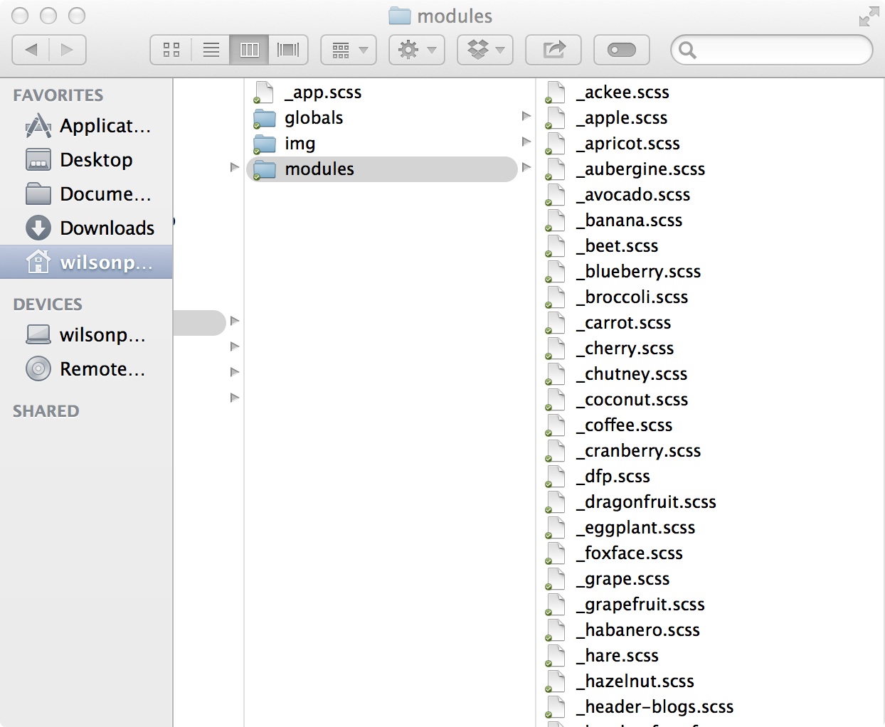
For each component we create a .scss. This file will live in a flat directory alongside all our other components. We don’t attempt to group or categorize anything, all components are created equal!
Next we need to get on and start styling our component, our main priorities here are supporting transportability and preventing leakage. Currently the only way we can achieve this is by pure discipline. Further down the road, we should be able to depend on new techniques of style encapsulation via ‘Shadow DOM’ and ‘Scoped-stylesheets’, but for now, we’re kind of alone.
Consider the following component:
<article>
  <h1>Headline</h1>
  <p>Body content</p>
</article>
One option for styling this would be:
article {
  padding: 1rem;
}

h1 {
  font-size: 3rem;
  margin-bottom: 1rem;
}

p {
  margin-bottom: 1rem;
}
This is a style leak nightmare! Those three rules will affect every other <artice>, <h1> and <p> in your application. Think of those rules as window globals in JavaScript. We have learnt to use closures to limit the scope of our variables in JavaScript; in CSS there is no concept of scope, so we need to fake it.
Let’s add some classes to these elements to differentiate them from the those of the same tagName.
<article class="my-article">
  <h1 class="headline">Headline</h1>
  <p class="body">Body content</p>
</article>
And style them:
.my-article {
  padding: 1rem;
}

.my-article .title {
  font-size: 3rem;
  margin-bottom: 1rem;
}

.my-article .body {
  margin-bottom: 1rem;
}
It’s nothing complex, but disciplined convention has given us the illusion of ‘scope’. My styles will no longer leak and impact components written by my team. But what this doesn’t protect us against is poorly written styles by other team members or third-parties.
Suppose another developer has carelessly written:
.title {
  color: red;
}
This case of common of class names will result in my component turning red. We must protect ourselves from this carelessness!
<article class="my-article">
  <h1 class="my-article_headline">Headline</h1>
  <p class="my-article_body">Body content</p>
</article>
.my-article {
padding: 1rem;
}
.my-article_title {
font-size: 3rem;
margin-bottom: 1rem;
}
.my-article_body {
margin-bottom: 1rem;
}There is now a very high probability our classes are unique, and we have prevented both leakage, and being leaked upon.
Using prefixed classes negates the need for parent selectors, this means that the elements within our component are portable. We can change our markup structure are not have to worry about updating our CSS, this speeds up development.
Summary
- Use the component name as the class of the component’s root element.
- Prefix all sub-elements like
component-name_*to prevent (and protect from) leakage. - Avoid polluting the global scope with generic class and tag selectors.
Plugins
Scope
Understanding the scope a component should have is crucial to maintaining a manageable code-base. I like to think of each UI component I write as a mini-app, or document.
By adopting this approach we write components that are completely decoupled from our application. Theoretically I could pick up a component written in one application and drop it into another. I’ve heard arguments that this is not a realistic use case, and perhaps that is true; but the subtle side affects that come with this approach are invaluable.
var MyComponent = fruitmachine.define({
  name: 'my-component',
  printName: function() {
    var container = document.querySelector('.container');
    container.innerHTML = 'my name is ' + this.name;
  }
});

/**
 * Usage
 */

var component = new MyComponent();
component.printName();
The above component is badly behaved. It’s making assumptions about its context, this smells like a tightly coupled component and tightly coupled components don’t smell nice.
MyComponent will only work correctly if .container is in the DOM when .printName() is called. If I’ve been assigned some work related to MyComponent, I, as a developer, must also understand other things about the application before I can start working on it.
Injecting dependencies
We can work around this problem by feeding our component the things it needs when we create it.
var MyComponent = fruitmachine.define({
  name: 'my-component',
  initialize: function(options) {
    this.container = options.container;
  },
  printName: function() {
    this.container.innerHTML = 'my name is ' + this.name;
  }
});

/**
 * Usage
 */

var container = document.querySelector('.container');
var component = new MyComponent({ container: container });

component.printName();
Our component is now making no assumptions about our application. Our application code it doing the job of linking .container with component. This is good, our application code shouldn’t be reusable, it’s the intelligent mortar between dumb bricks.
Contribution
Joining a large project is scary; there are a lot of unknowns. Making changes to a codebase you’re not familiar with can often feel like defusing a bomb.
An application comprised of many tightly scoped components can reduce the barrier to contribution. Devlopers can familiarise themselves with a small chunk of the application, and quickly feel comfortable making changes.
Tightly scoped components can dramatically reduce the barrier to entry for new contributors. Large tangled code-bases can become a minefield for new developers on the team. New developers can dive straight in and start making changes to components
Summary
- Treat each component as a ‘mini-app’.
- Write ignorant components that don’t depend on a their context.
- If a component needs to know something outside of its scope, pass/inject it in on instantiation, don’t make it fetch it itself.
Communication
For a component to integrate into an application it requires two way communication. The component should expose a public API to allow the parent application to use it, and should emit events to notify the application when things have happened.
This approach has been proven to work by native components such as the <video> element. But it’s important to play by the rules to stop things getting out of hand.
Components shouldn’t control your app
I’ve seen developers breaking component scope all too often. It’s tempting to call application API form directly within your component, but by doing this your greatly increasing the risk of circular dependencies. You application requires the component, your component requires your application. This is the point where code starts to get messy.
Application -> MyComponent -> Application
var galleryController = require('gallery-controller');

var ImageComponent = function(src) {
  this.el = document.createElement('image');
  this.el.src = src;
  this.el.addEventListener('click', function() {
    galleryController.showGallery();
  });
};
Events allow us to keep the dependency chain linear, and pass communication back up the chain.
Application <-> MyComponent
Events shouldn’t be used as API
Events are powerful, but they can be used in the wrong way. One application I worked on became an event based nightmare after developers started using event emitters for the first time.
Instead of modules having an explicit API, they responded to events. Calling an event had a chain reaction of affects across the application, that quickly span out of our control. I learnt some very important lessons from that project:
- Call API to cause something to happen
- Use events to signal when something has happened
- Fire from where the event happened (target)
Example
I’ll try to illustrate my point with a simple example of two components: MyButton and MyOverlay. I want like to show the overlay when the button is clicked.
var MyButton = fruitmachine.define({
  name: 'my-button',
  tag: 'button',
  setup: function() {
    var self = this;
    this.el.addEventListener('click', function() {
      self.fire('click');
    });
  }
});
var MyOverlay = fruitmachine.define({
name: 'my-overlay',
show: function() {
this.el.classList.add('visible');
}
});var overlay = new MyOverlay();
var button = new MyButton();
overlay
.render()
.appendTo(document.body)
button
.render()
.appendTo(document.body)
.on('click', overlay.show);Bubbling
I think one of the coolest things about the DOM is event propagation. As FruitMachine evolved we saw the opportunity to implement a similar concept to further decouple our application controllers from view components.
Our application layouts were a nest hierarchy of components. The specific components in the layout depended on the layout definition. This meant that our controller could not always be sure or which components it was controlling, and we often ended up with code like.
var button = layout.module('my-button');
if (button) {
  button.on('click', overlay.show);
}
This started to become very messy. We needed a simpler way to bind to events from unknown components in the view.
We came up with the solution of event bubbling and delegate event listeners, a familiar pattern, except this time applied to components.
It was a simple change: when an event fires on a component, we would also fire it on the parent component; effectively bubbling the event all the way to the layout root. This greatly simplified our application code.
layout.on('click', 'my-button', overlay.show);If my-button doesn’t exist as a child component of layout, it doesn’t matter. Everything will continue to work as expected.
Summary
- Events are critical to a decoupled component based architecture.
- Components emit events when they need to tell the application something has happened inside their world.
- Use API to cause change.
- Use events to respond to changes.
Performant components
We’ve established that a well written component should be tightly scoped and ignorant. This keeps code clean and decoupled. But our components have permission to do anything in their domain, even DOM manipulation. But can’t badly managed DOM manipulation get expensive? Yes, yes it can.
Layout thrashing
Layout thrashing is the act of repeatedly writing to, and then reading from, the DOM. It’s expensive.
componentA.innerHTML = 'I am component A'; // Write
componentA.clientHeight; // Read (reflow)

// ...

componentB.innerHTML = 'I am component B'; // Write
componentB.clientHeight; // Read (reflow)

// ...

componentC.innerHTML = 'I am component C'; // Write
componentC.clientHeight; // Read (reflow)
Your application should ideally never ‘layout thrash’, but this is easier said than done, especially now we have loads of black-box components doing whatever they like with our temperamental DOM. We need a way to orchestrate component’s DOM interactions if want to keep our application fast. I wrote FastDOM to solve this problem.
FastDOM
FastDOM wraps your DOM read/write work, and runs it on the next animation frame in two batches: reads, then writes. This avoids layout thrashing as the DOM is only being reflowed a maximum of once per frame.
fastdom.write(function() {
  componentA.innerHTML = 'I am component A'; // Write
  fastdom.read(function() {
    componentA.clientHeight; // Read
  });
});

// ...

fastdom.write(function() {
  componentB.innerHTML = 'I am component B'; // Write
  fastdom.read(function() {
    componentB.clientHeight; // Read
  });
});

// ...

fastdom.write(function() {
  componentC.innerHTML = 'I am component C'; // Write
  fastdom.read(function() {
    componentC.clientHeight; // Read
  });
});
What used to cause three document reflows, now only causes one.
Layout Boundaries
Another interesting discovery I made in my quest for performance was ‘layout boundaries’. Whenever the DOM changes, the browser must perform ‘layout’ to calculate the size and position of each element on the page.
The browser starts at the point in the DOM that was changed, walking its way up the DOM tree laying out each node that it encounters. It will keep walking until it hits a layout boundary, more often than not, this is the the document root (<html>), meaning the whole document is laid out again.
When an element has a specific set of style properties, it classifies as a layout boundary. Introducing layout boundaries limits the scope of layout, making the whole layout operation faster.
In order to act as a layout boundary, an element must:
- Not be display
inlineorinline-block - Not have a percentage
heightvalue. - Not have an implicit or
autoheightvalue. - Not have an implicit or
autowidthvalue. - Have an explicit
overflowvalue (scroll,autoorhidden). - Not be a descendant of a
<table>element.
In other words: if you set a px or % width, px height and set overflow to hidden; a <div> becomes a layout boundary.
In the Financial Times app we used this technique to make the root element of each of our components a layout boundary. Events that occurred after the initial page render, such as lazy image loads, or animations would only ever cause the single component to re-layout, not the entire document.
After this change, we saw layout performance improvements of up to 3x!
[Insert devtools screenshot]
Summary
- Use a tool like FastDOM to harmonize thrashing components.
- Experiment with layout boundaries to improve post-render layout performance.
Responsive components
Modern web applications need to be able to adapt their layout to fit the device in use. A lot has been written about how applications can make use of media-queries to change the appearance of elements on the page, but sometimes this isn’t enough.
When our applications are made up of components, many of theses components are going to need to change in appearance, and some of these components are going to need to change their behaviours and interactions.
Transforming components
We first faced this challenge when designers passed us visuals for a page that, in landscape, had a scrolling story component, but in portrait, a tabbed component with the same content.
We didn’t want to have to use two separate components for this job. We wanted a single semantic piece of HTML, that simply looked and behaved differently at declared breakpoints.
Defining breakpoints
For this job we wrote a re-usable plugin for our FruitMachine library. The plugin allowed you to declare more granular setup and teardown logic on a per breakpoint basic.
var MyComponent = fruitmachine.define({
  name: 'my-component',

  breakpoints: {
    'column': {
      setup: function() {
        // Add scrollers
      },
      teardown: function() {
        // Remove scrollers
      }
    },
    'row': {
      setup: function() {
        // Add tab click logic
      },
      teardown: function() {
        // Remove tab click logic
      }
    }
  }
});
Listening for breakpoints
We then needed a way to know when a component entered and left one of the defined breakpoints. Out first solution was based on a solution I first read about on Jeremy Keith’s blog. It involved changing the content value of a hidden pseudo element using media-queries.
@media(orientation: landscape) {
  .my-component:after {
    content: 'column'
  }
}

@media(orientation: portrait) {
  .my-component:after {
    content: 'row'
  }
}
Then checking the value of this content property in JavaScript, whenever the window was resized.
window.addEventListener('resize', function() {
  window.getComputedStyle(myComponent.el, ':after').content; //=> 'column'|'row'
});
In the full implementation we would store the value of the last state so that we could detect when the component changed state. The callback was also ‘debounced’ so that it didn’t run too frequently.
This implementation allowed us to couple JavaScript logic to breakpoints defined in our CSS. It was relatively simple and it worked, but later proved to be one of the biggest bottlenecks in our layout performance when we started to roll the app out across lower end devices.
It turned out that window.getComputedStyle() causes document layout, and is pretty expensive, especially when run several times a second per component! We needed a better solution.
window.matchMedia
I knew what I had created was pretty horrific, and I needed to come up with a better solution quickly, before the rest of my team found out what I had done. Luckily I stumbled across a less well known feature of window.matchMedia.
I had known for a while that matchMedia was able to tell you whether the document currently matched a given media-query. What I didn’t know was that you could attach listeners that would tell you when the given media-query became matched or unmatched. This was exactly what I needed, it was time to shift.
I re-wrote the FruitMachine plugin to interpret two properties of the component definition: media and states.
var MyComponent = fruitmachine.define({
  name: 'my-component',

  media: {
    'orientation: landscape': 'column',
    'orientation: portrait': 'row'
  },

  states: {
    'column': {
      setup: function() {
        // Add scrollers
      },
      teardown: function() {
        // Remove scrollers
      }
    },
    'row': {
      setup: function() {
        // Add tab click logic
      },
      teardown: function() {
        // Remove tab click logic
      }
    }
  }
});
The media property mapped media-queries to states. The plugin would also add the currently matching state as a class to the component. This allowed us to keep all our media-queries in JavaScript, and not have to duplicate them in the CSS.
.my-component.column {
  /* 'column' styling */
}

.my-component.row {
  /* 'row' styling */
}
This proved to be a lot more efficient. We no longer had to use window.getComputedStyle and we no longer needed our window ‘resize’ listeners.
Overriding defaults
The has been heated debates over the deficiencies of @media at the component level, and strong cases have been made for the @element level media-queries. But unfortunately, they don’t exist yet, and we have to build apps now!
As we reused components in different parts of the app, the default media-queries weren’t always appropriate. We needed a way to define what these media-queries should be on a per-instance basis. Fortunately, because our media-queries were now in JavaScript, this wasn’t too tricky to build into our plugin.
Let’s say in an different layout we wanted our article component to be in ‘row’ form in landscape and ‘column’ form in portrait.
var component = new MyComponent({
  media: {
    'orientation: landscape': 'row',
    'orientation: portrait': 'column'
  }
});
This added control enabled us to solve further unforeseen problems in the app, and allowed us to re-use components in places where otherwise we would have had to write from scratch.
Conclusion
Moving towards a component approach has completely changed the way I think about front-end development. Building applications from small building blocks is manageable and it scales. Whatever your framework of choice, the same lessons usually apply.
- Keep components tightly scoped to promote reuse and reduce tangled code-bases
- Make components configurable to maximise their usage
- Expose a public interface so components can be controlled
- Use events to react to changes inside components
- Timeline your apps to keep an eye out costly DOM work
- Use smart CSS selectors for rock solid styling
- Look to existing web-components (like
<video>) for inspiration window.matchMediacan help with complex ‘behavioural’ breakpoints
If we’re going to get better and better as an industry we should look at at the lessons learnt in other engineering disciplines. Manufacturing an entire car from scratch is no longer competitive, parts are manufactured and sourced from all over the world, then assembled in one place.
Imagine a web of trusted, shareable components at our fingertips. More people, building higher quality applications, with ease. If we embrace this change, if build this platform, we can make the web win.