Introducing 'layout boundaries'

‘Layout’ is the process a browser undergoes to calculate the position and size of each element in a document before it can start painting pixels. The process of layout can be costly, especially on low powered mobile devices.
As considerate front-end developers, it is our job to keep layouts to minimum to ensure our apps remain snappy.At some point though, layout has to be done. DOM structure changes, changes to dimensions or position of elements, and requests for element position or size via JavaScript, can all trigger layout.
What is not commonly known, is that layouts events have scope. Most of the time a layout forcing change to one small part of your app, will cause the entire document to be reflowed; and this can mean thousands of nodes.
Introducing ‘layout boundaries’
With a few small CSS tweaks we are able to enforce layout boundaries in our document. This means that if any layout forcing changes are made inside the scope of a layout boundary element, only a ‘partial reflow’ is required, and this is a lot cheaper!
To be a layout boundary, the element must:
- Be an SVG root (
<svg>). - Be a text or search
<input>field.
or:
- Not be display
inlineorinline-block - Not have a percentage height value.
- Not have an implicit or
autoheight value. - Not have an implicit or
autowidth value. - Have an explicit overflow value (
scroll,autoorhidden). - Not be a descendant of a
<table>element.
Paul Lewis’ Boundarizr tool can be used to highlight which elements in your app are acting as ‘layout boundaries’.
Facebook example
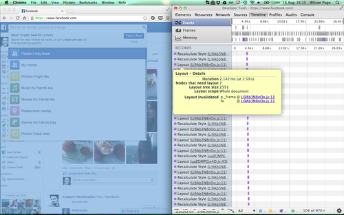
To prove my point I have found a layout case on Facebook that could be optimised. When the auto-complete search drop-down is opened we can see in the timeline quite aggressive layout thrashing as elements are inserted and manipulated in the list.
By hovering over the layout event in Chrome Devtools Timeline we can see that the ‘Layout scope’ is labeled as ‘Whole document’ (highlighted in blue), the ‘Layout tree size’ is 2551 nodes, and the ‘Duration’ is 2.142ms.
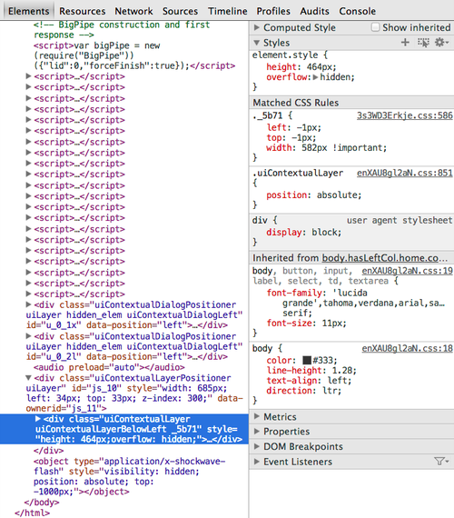
Diving into the Elements panel I find a suitable parent node above where the DOM changes are taking place. I set a pixel based height, and set overflow: hidden. The element is already position: absolute, and already has a width set, so I don’t have to introduce those changes.
This should enforce a layout boundary to scope the reflow to a much smaller portion of the document.
I now run the same routine and observe the layout events again in the Timeline panel.
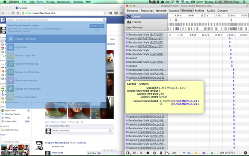
When we hover over the layout event we can see the blue highlighted area now only covers our newly promoted ‘layout boundary’ element. The ‘Layout scope’ is now labeled as ‘partial’, the ‘Layout tree size’ is 228 nodes (91% reduction) and the Duration is 1.255ms (41% reduction).
Is this a micro-optimisation?
In terms of duration per layout event a saving of ~1ms seems pretty negligible, but let’s take a few more points into consideration:
- This event was one of about 20 similar events that were triggered when the drop-down menu was revealed, and each one gained a similar saving following the CSS tweak.
- We are profiling this on a high powered MacBook Air within Google Chrome. The speed of layout within this type of environment greatly outperforms that of even the most performant mobile devices. If we are reducing layout time by 40%, the gains on devices that are slower at layout could be significant.
- This particular layout is relatively simple. Within a more complex (flexbox, tables, floats, etc) layout we would likely see greater gains.
How does this work?
TBH I’m not 100% sure. I would guess that by constraining the size of the parent element and making sure descendent elements cannot flow out of the boundaries by setting overflow: hidden;, layout engine optimise by making the assumption that nodes outside the layout boundary do not have to be checked.
Is this just applicable to Chrome?
TBH I’m not sure, but I would guess that other browser layout engines would make similar optimisations when element style properties permit.
At the time of writing (AFAIK) we don’t have the same level of layout profiling available to us within other browser’s developer tools.
If there are ways we can measure this inside browsers other than Chrome I would love to hear about it :)
Conclusion
To me this seems like something we should really be considering more in development. If we can make some super quick style changes that enforce layout boundaries, the browser has to do less work, and we get faster layout times.
Try it out in your app and let us know if you are able to make some quick performance gains.